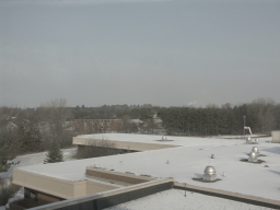
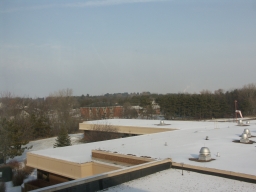
Contrast -5
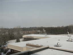
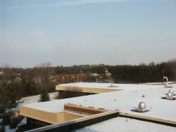
Contrast 0
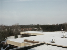
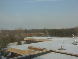
Contrast +5
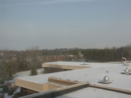
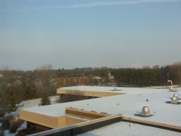
Color -5
Color 0
Color +5
This is a test of the image processing software resulting in a jpeg file.
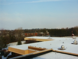
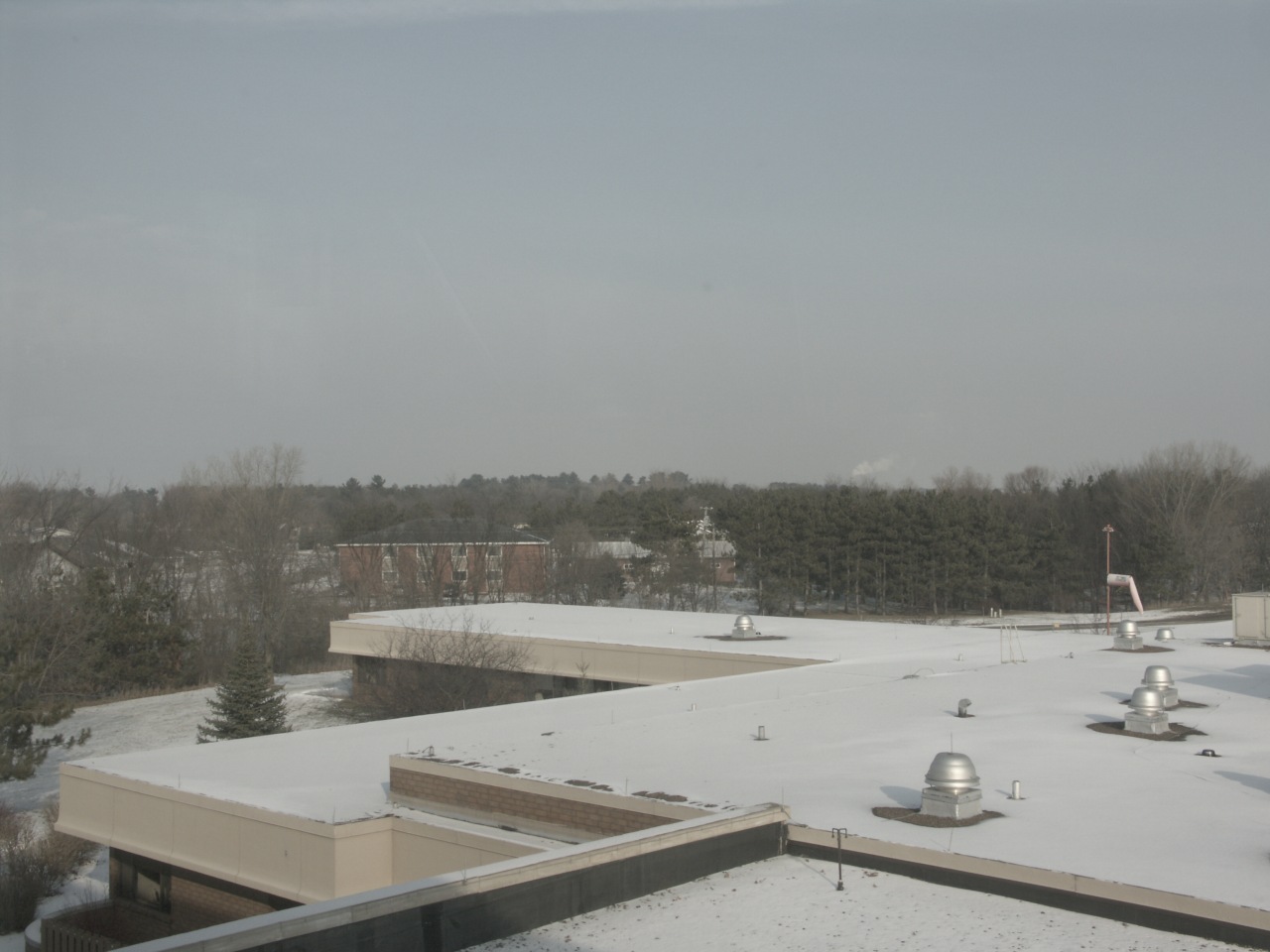
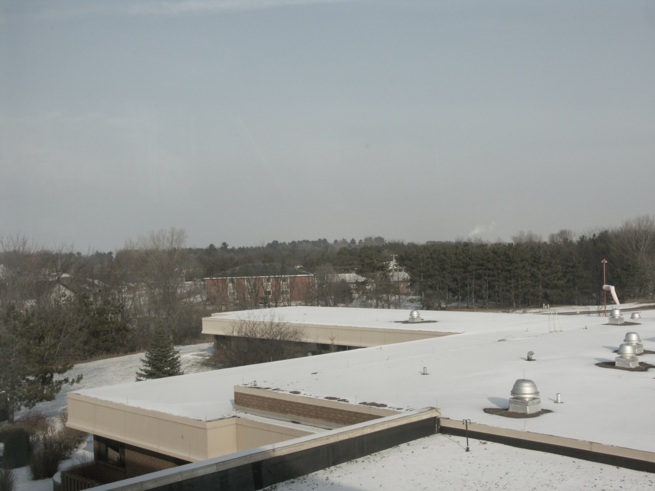
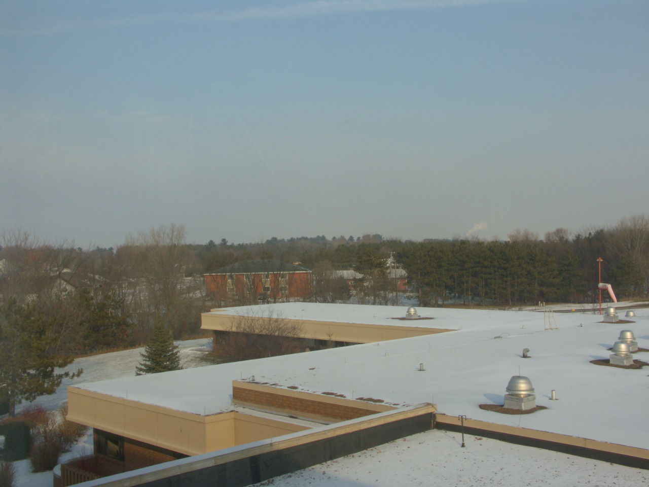
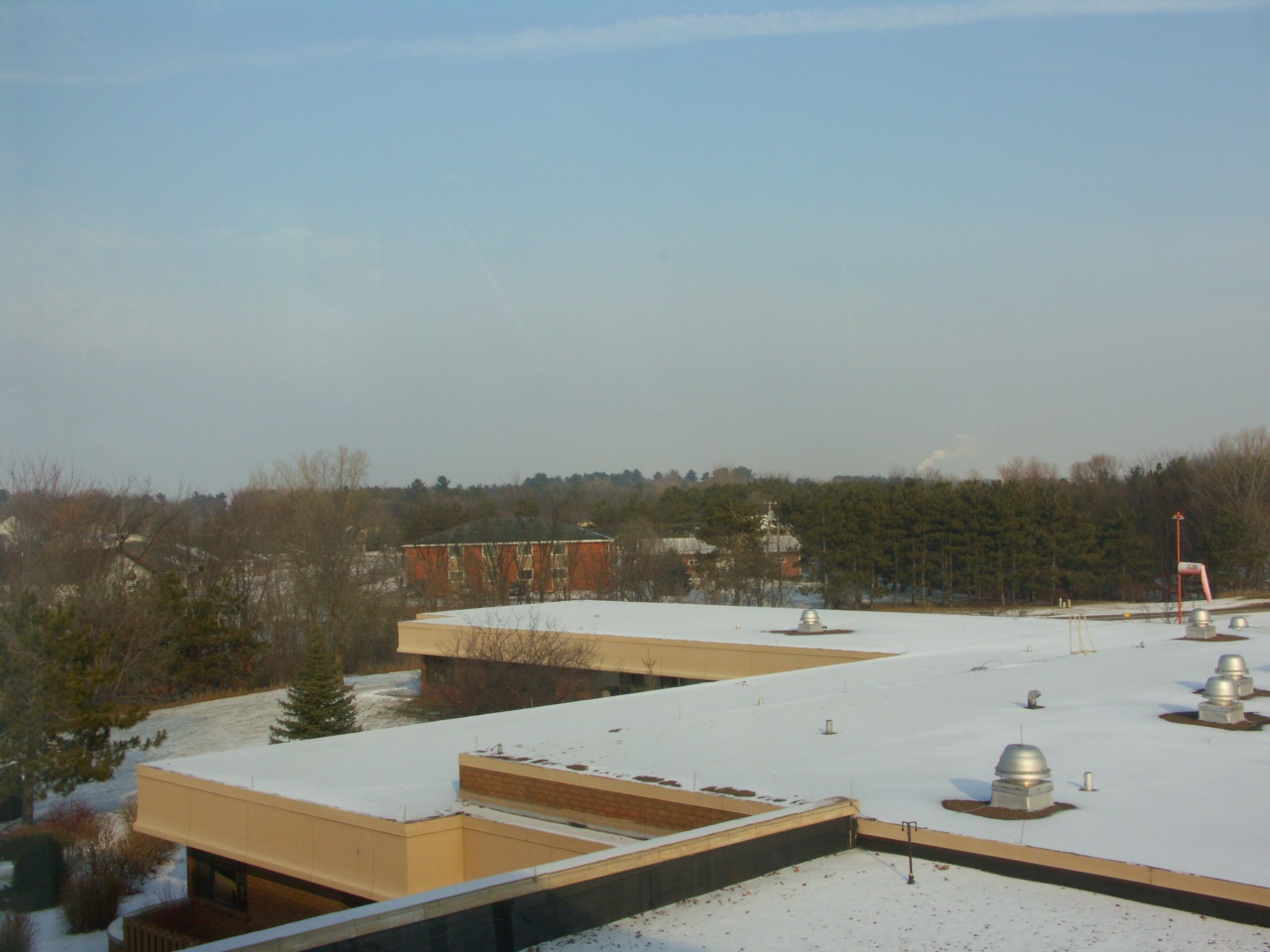
December 28, 2004; Menomonie, Wisconsin. In case you care, this is the view northeast from my office. Not pretty, but very handy. The goal was to test the range of contrast and saturation adjustments of the A2 camera using a low-contrast, low-color target, and this image seemed to exactly meet that standard. A faintly blue sky, red brick, white snow, distant wintertime norway pines and leafless trees, and a faded wind sock at the right. On my monitor, Color 0 Contrast 0 is a pretty close emulation of the values of the scene.
Click on the photo for a 256-pixel-wide version, and click on the filename below it for a 1280-pixel-wide version, to see detail better.
|
|
Contrast -5 |
Contrast 0 |
Contrast +5 |
|---|---|---|---|
|
Color -5 |
|||
|
Color 0 |
|||
|
Color +5 |
All images were of a flatly lit, drab, colorless scene, a mid-day (12:55 pm) winter landscape, with thin cirrus overhead.
All exposures were at f8.0, 1/60 second, placing the snowy rooftops on Zone VII to preserve detail. No filter was used.
The appearance of pict0409.jpg in the electronic viewfinder was the image closest to the actual scene, looking at the scene with one eye and the EVF with the other; but the EVF is a low-gamma display, and always looks flat compared to a terminal or the final print.
The appearance of pict0405.jpg in the external camera display was the image closest to the actual scene, but this is a coarse-grained image that does not closely resemble anything.
The appearance of pict0405.jpg on the computer monitor is, to my recollection, closest to the actual scene as viewed on my ViewSonic monitor at home.