Characteristic Curves
of the Konica-Minolta DiMAGE A2
8 Mpixel Digital Camera
This essay describes some simple work that I have done to explore the sensitivity of the imaging chip and the characteristics of the image processing software in the A2 camera.
Summary:In the best case, this camera records detail across a range of about 8 stops of brightness, and contains detectable image detail about 3 stops below that but which is not usable pictorially because of noise.
Within this range, the image processing is designed to produce soft, low-contrast values below middle gray, and harsh, high-contrast values above middle gray (OK, "snappy"). As with all digital imaging, all detail suddenly vanishes when the sensors are saturated, making highlights look "blocked up."
The white balance correction algorithm exacerbates this compression of the bright values, espeically when used with strongly imbalanced light sources such as tungsten or "deluxe warm white" fluorescent. The constriction of the brightness range of higher values, decreases the sensitivity range by at least 1 stop, exacerbating the digital tendency to produce blocked-up highlights. (Zone VII becomes the highest value in which texture is preserved.)
To counteract this tendency, when the bright values are important, the photographer may wish to "underexpose" by 1 to 1.5 stops when creating the image and then to adjust the image with the curves tool. Fortunately, the camera is able to display a real-time histogram prior to exposure, so it is easy to keep high values from saturating the sensor.
- Another, more precise technique, is to simply spot-meter the brightest area in which detail is important, and simply close the lens and/or shorten the shutter speed by a total of 2 1/3 to 2 2/3 stops, placing the area into Zone VII.
- Or, to keep it really simple, set the camera's exposure compensation to its maximum, -2.0 stops and meter from the bright areas. (This will set the bright area on Exposure Zone VII.)
- The only concern with this technique is whether the shadow values will be adequate. This camera has a long "toe," so there will usually be no question that detail can be retained, especially using raw images, but the penalty of extending the range into the dark values will, at some point, be excessive noise in shadows.
- Last, using the real-time histogram will help you avoid bunching image values at either end of the brightness range. I've discovered that tiny areas aren't represented on the histogram, but otherwise the histogram will help prevent pixel saturation in the bright areas.
If you adjust the jpeg image contrast, the histogram will expand and contract as you change the contrast setting. When working under time pressure, this may not be satisfying, but in general we tend to take a series of photos in any given lighting situation. So when we find settings that are good for one image, we can keep them until the lighting situation changes.
For examples, I've found that contrast -5 is the only reasonable setting for a bright sunny day, and then avoiding pixel saturation of image highlights is a challenge. On the other hand, setting contrast to -5 on an overcast day, and the white balance to "cloudy" can save a lot of post-processing work.
The technique
I shot a series of images using a standard target that I created many years ago to ease my task when calibrating film and development for the Ansel Adams Zone System, and next to it I placed the 18% gray card and standard color patches of the Kodak Color Darkroom Data Guide.
My standard target is a board that I created by drawing a line down the middle and then painted it with neutral gray paint such that one half is exactly twice as bright as the other. It has not yellowed in 35 years, while the 18% card has. If you want to make one yourself, here's the instructions.
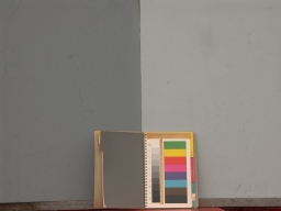 Front.
The light source was an overcast sky at 3:15 pm on a December afternoon: pretty blue. The color balance was set in the camera to make the dark side neutral: the camera was pointed at it and the "custom color balance" button was pushed; then this setting was used to take the photo.
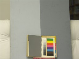 Back.
Back.
For this image, the color balance was set by interpreting the raw image -- exposed under deluxe warm white fluorescent lights -- with dcraw and setting dcraw to interpret the light side of the board as neutral. I suspect the different color casts of these two images are due to the fact that neither light source is balanced as well as the fact that the camera and the dcraw program may use different color-correction algorithms.
I shot two tests for this presentation: one was at night, in my basement, under deluxe warm white fluorescent lighting, an arbitrary choice based on what was available at 10 pm in my house. When I have time, I will include some of the results here, and must say that, as with much research, the first foray into learning only shows that there must be a better way, and raises interesting questions. In this case, the strongly unbalanced spectrum of these lights produced interesting results, but I clearly needed to repeat with a balanced light source. It is December, and normal sunlight is currently not available, so I used the light of a brightly cloudy day, with the targets facing the east sky; the disk of the sun visible low in the south (1pm) but only occasionally producing shadows.
I plan to repeat this testing in sunlight -- if we get any when I have time off work and it is within my consciousness that I was intending to do the repeat.
The Zone System
I will take a moment to summarize the Zone System, not because it's so difficult to understand, but because it is susceptible to personal interpretation: you deserve to know what I mean by the terminology.
Exposure Zone: The luminances of the objects to be photographed can be measured. A doubling of brightness -- or a halving -- is a one-"stop" change in camera exposure. A "zone" is the range of luminances encompassed by any one-stop variation in brightness.
By convention, Zone Zero (0) is the brightest luminance that can't be detected by the imaging device, be it film or a digital array; Zone One (I) is the luminance range one stop above this, the one-stop range of first detectable luminances. (If you're technically precise, it's the first luminances that are detectable by the sensor and are visually perceptible by the human viewing the image. But what is perceptible depends very much on the viewing conditions, and I want to skip that consideration for now.) It's also important to realize that the definition of zones is relative to the excellent film and paper materials that Adams worked with during his career.
Also by convention, Zone Five (V) is middle gray, the famous 18% reflectance card or its equivalent. This is the most important value.
The zones were defined by Ansel Adams as follows: (Polaroid Manual, Morgan & Morgan, 1963, page 31)
- 0 Full Black
- I First visible step of Value (threshold)
- II Lowest effective textural values
- III Dark material; deep shadow Values, (well textured)
- IV Average dark foliage; shadowed Caucasian skin
- V Middle Gray; the "pivot value" (the 18% card)
- VI Average Caucasian skin value
- VII Sunlit Caucasian skin; light-gray objects
- VIII highest textured values (depends on media)
- IX First step of visible tone below pure white (the paper's threshold)
- X Pure white; equivalent to sensor saturation.
Now, even Ansel modified this classic definition, depending on his materials. Except that zone V was always middle gray, even when his materials lost textural value in Zone II or Zone VIII. For example, Polaroid materials had higher-contrast highlights than those on which he developed the Zone System, so he simply stated that for Polaroid prints the highest value containing texture was Zone VII 1/2 and that Zone IX was burned out, pure white. And when he was working with transparency materials, sometimes Zone XII was pure white and Zone X was the highest with textural value.
Here's a zone "ruler" that I created after the extensive testing describes in these pages. The intensity values are those rendered in the DiMAGE A2 image at a contrast setting of -5 and normal exposure from an 18% (middle gray) target. It is not an attempt to reproduce the above definitions.
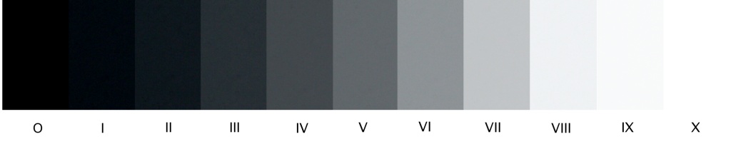
Zone V is the intensity obtained in the object from which the exposure is derived; each zone in this figure is one stop above or below that exposure value. This ruler was created by taking a faintly textured target (my target board) and pasting into a new image each of the zones obtained with exposures.
The most interesting observation I made from this scale is how very narrow the exposure range of this system really is: Zone II is effectively black; Zone IX is effectively white; there are about 7 stops of range in which the detail is clearly evident. On the other hand, you can record raw images (50 seconds to save each if raw+jpeg is chosen) and use dcraw to manage the characteristic curve to your heart's content.
As long as we don't get stuck on fitting our results rigidly into Ansel's original 10-stop scale, we can do useful work. The key points are --
under good viewing conditions:
- Where is the perceptual threshold?
- Where is the first perceptible dark texture?
- What exposure replicates middle gray?
- Where is the brightest perceptible texture?
- At what exposure is the medium saturated?
I want to call these values "Exposure Zones" to emphasize that I am not going to worry too much about the viewing medium. When Adams talked about final result, he used the term "Print Zones" and was talking about brightnesses in the print, not the object luminances that created them. I am not making prints, and I cannot control the conditions under which you view the images on your monitor. So I will use "Exposure Zones" to focus our attention on object luminances. I haven't used the industry-standard "Exposure Value" because I prefer, for this discussion, a flexible value centered around middle gray.
For the clearest explanation of characteristic curves and how to use them in the study of imaging, read White/Zakia/Lorenz, The New Zone System Manual Revised Edition. This book is oriented toward film, but every concept and technique applies, only instead of using a densitometer to measure film densities (0-2.5), you use the gimp or photoshop to measure pixel values (0-255).
For other excellent work on imaging and characteristic response, search for Richard Zakia's works. He was professor in the Rochester, NY, School of Photographic Arts until about 1993, when he retired. The best listing of his books that I could find was at CampusI.
Next topic: The DiMAGE A2 characteristic curve.
Other topics:
Gamma management using dcraw and the gimp.
Contrast Management using DiMAGE A2 in-camera Settings
The effect of changing saturation ("color") and gamma ("contrast") using in-camera controls.
DiMAGE A2 Exposure Accuracy
The DiMage A2 Sharpness Algorithm
Change in Contrast with custom White Balance
Making a Zone System Exposure Target